
Bright colors for the home are increasingly popular in decorating projects. However, its use requires careful composition with other elements of the environment, to maintain harmony.
Although the current trend is towards minimalist decor, it is natural that many leave out the more vibrant tones, but know that it is possible to create excellent combinations without overwhelming the space. That’s why, in this post, we’ve prepared some tips that will help you give more life to your decor, through the correct use of strong colors. Come on?
Understand the color proposal
Choosing the correct shade is the fundamental step in any decorative project. Believe me, each color can create a sensation in people. Therefore, think about the purpose of each room in the house or apartment. When it comes to your child room it is very tough to choose exact wallpaper, in addition to considering the style of the environment and the personal tastes of the residents.
It is important to note that strong colors are not directly linked to warm colors, however, they are included. For example, yellow, orange, red and terracotta are tones that increase luminosity, provide joy and optimism, bring a great mood to the space and also stimulate the appetite.
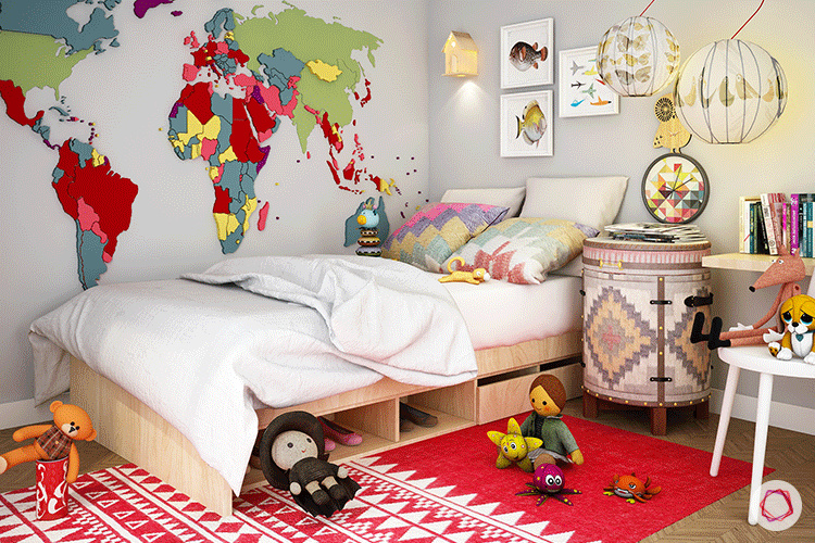
If your child has the ideal cartoon fan, decorate with the stickers those wallpaper that is peel and stick. In contrast, you can create color dots using cool colors such as violet, blue, and green. Even if they are used in the strongest palettes, they still guarantee a more relaxed and refreshing atmosphere. But, of course, harmony with neutral tones is essential in order not to lead to introspection.
Make a harmonization
The harmony between tones can occur between neutral and vibrant options, as well as between strong color combinations, to create a fully colored space. In the second situation, have the color wheel as your ally. That way, you’ll discover different combinations, without overdoing it.
Consider the size of the site
This is one of the first concerns you should have on a project. The size of the room makes all the difference when defining the tones of the decoration. As our home is our refuge, very large spaces must be cozy. For that reason, abusing dark tones is an excellent idea to reduce space. In projects for small environments, on the other hand, betting on strong tones for decorative objects or details on the wall is a way to give it more life, without causing a feeling of suffocation.
Avoid exaggeration
Understand that sophistication is generated from the balanced distribution of colors among all design elements. The most interesting thing is that the harmony between the rooms in the house must also exist, otherwise the residence becomes a decorative competition.
So, if you chose to highlight one of the walls with a bolder color, or decided to invest in colorful furniture, try to create an environment without too many decorative elements that could smother the decor and choose wallpaper that is easy to paste and peel off, if you want to buy just go with kids peel and stick wallpapers.
Think about lighting
Spaces that have bright colors in the decor tend to look darker. However, avoid this feeling with a good lighting design, in addition to ensuring that the environment has excellent natural lighting, ensuring more lightness.
If necessary, create combinations between white and yellow light bulbs, using them in more places in the room. Furthermore, the installation of mirrors also contributes to the clarity of the environment.